Getting women birth control and UTI treatment appointments from their phone with Planned Parenthood.
Getting women birth control and UTI treatment appointments from their phone with Planned Parenthood.
Planned Parenthood Direct
Updating the UX and refreshing the brand elements for the Planned Parenthood Direct app.
Contents
Product design, user research, user testing, systems design
Credits
Myself, Aaron Berge, Adam Freeborn
Timeline
~6 months
Role
UX/UI, user testing, main point of contact
The Problem
The design system for the Planned Parenthood Direct app was inconsistent, had accessibility issues, and had users struggling to navigate the app and get where they needed to be.
What We Did
Originally a UX audit for an alpha of the Planned Parenthood Direct app, we directly worked with the Planned Parenthood team to look at the UX, implement feedback from users, and improve the experience, and refresh the brand elements.
The Design Challenge
How might we better serve the birth control ordering and UTI appointment experience to cater to an ever-evolving app space?
Before we begin...
Research & Context
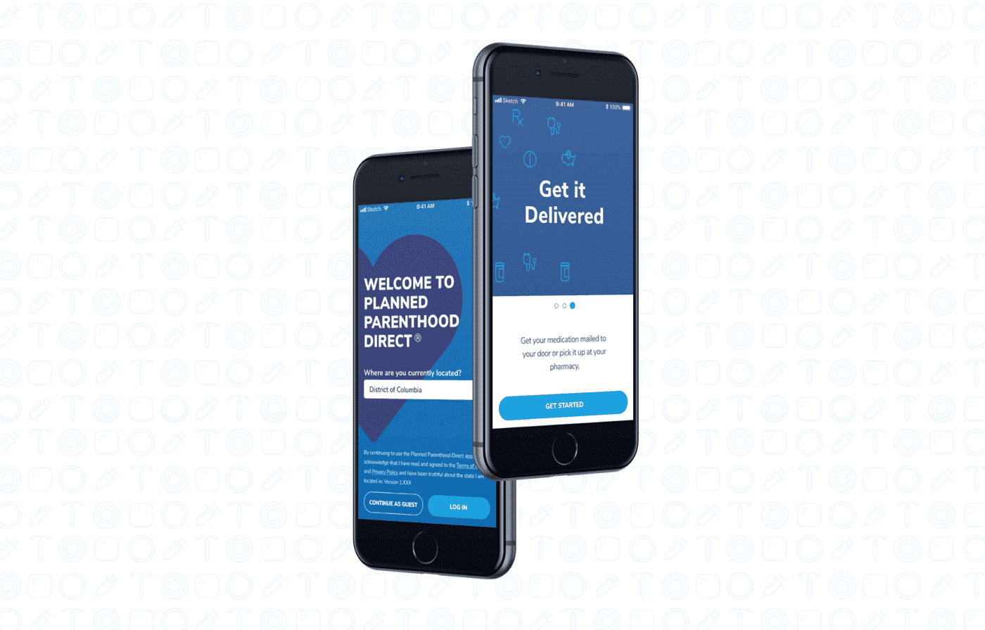
Initially, we were approached to perform a UX audit on a pre-release version of the Planned Parenthood Direct app, an app focused on giving women an option to order birth control and UTI appointments discretely and safely through their phones. After combing through the app, we found some concerns regarding navigation, accessibility, and inconsistency in the design elements and UX. We were then tasked with implementing improvements and updating the app for release.
To gain a better understanding of the issues we identified, and to validate the concerns that were brought up when conducting the UX audit, we conducted anonymous A/B user testing, as well as provided surveys to users using SurveyMonkey to get more detailed feedback on the initial designs as well as the iterative designs we proposed.
With the importance of a seamless and understandable experience for modern smartphone users, especially within a sensitive and private space such as their health, it was important for us to nail the UX, which called for a re-haul of several flows of the Planned Parenthood Direct app's UX and design.
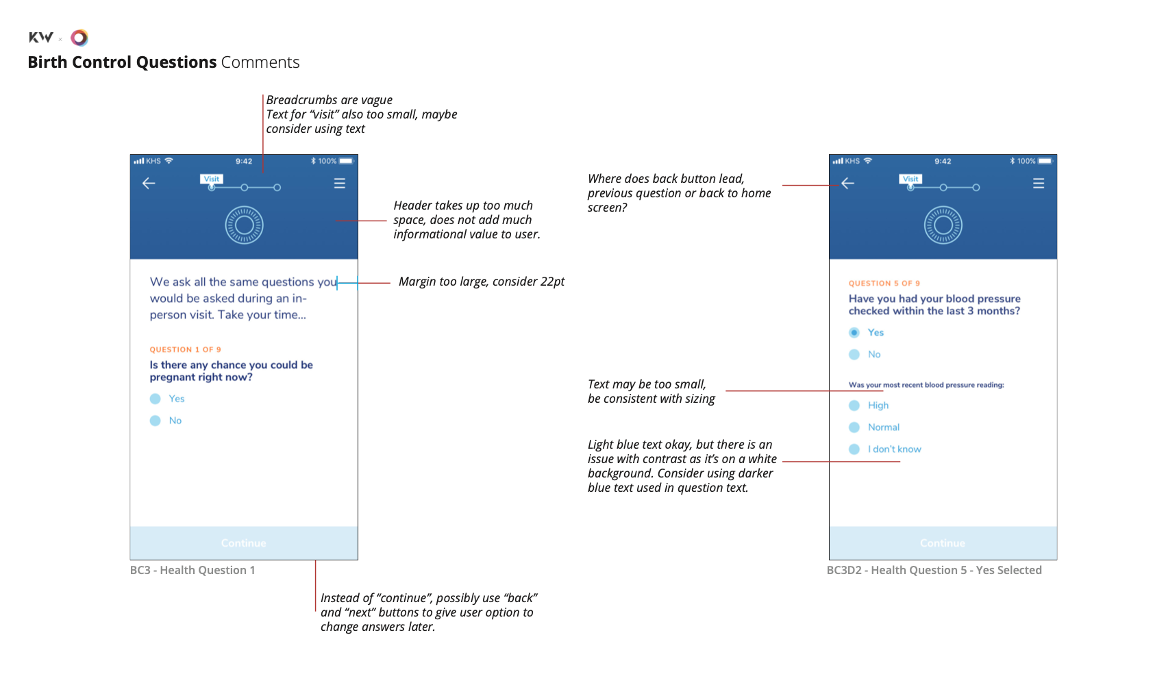
Some comments we had for the alpha version of the app.
Challenges
A Whole New Space
This was my first time working with an app and fairly well-known company. The importance of this app has greatly increased as the times have changed, so the pressure in getting things right was heavy.
Much of the challenges that came with this project were managing expectations, both from the team and client. Working together many people had many ideas for implementation and improving the UX, and only through user testing could we really narrow down those ideas and find the best solutions to better serve the users.
Pain Points
☞ Users struggle navigating the app
☞ Non-accessible design
☞ Inconsistent design system & implementation
Solutions
☞ Entire UX audit of app
☞ Update components to be A11Y accessible
☞ Review design system, components; organize and refresh elements for consistency.
User Testing → Takeaways
Consistency is Key
Though designed with the medical experience in mind, many of the interactions we found and were validated through user testing sessions were confusing. Sometimes, less is definitely more, especially in communicating the functions of certain actions and buttons.
Consistency was also key in minimizing confusion when it came to working with the design systems, which further enforced the idea of less is more.
Key Takeaways
☞ Less is more — Keep it simple for better engagement
☞ Manage expectations — For both your team and the client
☞ Consistency is key — For the design system
Reflections
Looking back
This was my first project working with such a delicate subject and with a project that was going to impact a considerable amount of users. Many times during this project I questioned whether or not the next step I was taking was the right one, but with the help of a great team, and seniors that assured me in the decisions I was making, we were able to push through and gain a better understanding of what this project needed, and deliver something meaningful and exciting to the client.